Project: Titanium Muas Website
Overview
The artist had been having difficulties with selling their printed artwork online. The artist needed a responsive website to help alleviate some of the obstacles of buyers.
Project Duration
January 2024 – April 2024
My Role
Lead UX Designer responsible for research, wireframing, lo-fi prototypes, mockups, and hi-fi prototypes.
Research Summary
The first thing that I did was research other artists’ websites to see what was working and what wasn’t working well on their websites. Then I brought this information back; the things that were working well were noted down so that I can utilize them in my designs in the future. For the things that weren’t working well, I brainstormed solutions to those things so that I can implement them into my designs.
User Pain Points
1. Users want to see available artwork right away (Solution: Put available artwork on home page)
2. Websites are too busy (Solution: Simplify homepage to attract the user’s attention right away.)
3. Users want to be able to buy artwork easier and faster (Solution: Figure out a way to make the buying process flow quicker.)
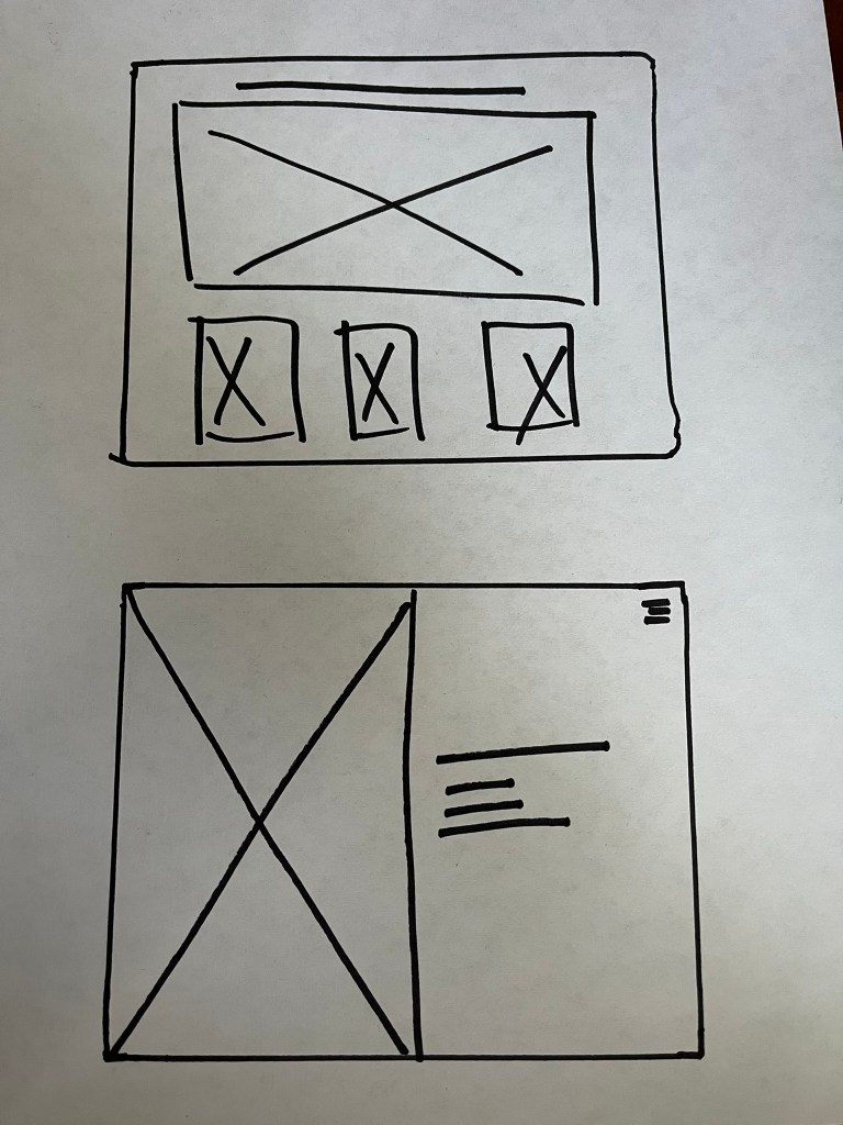
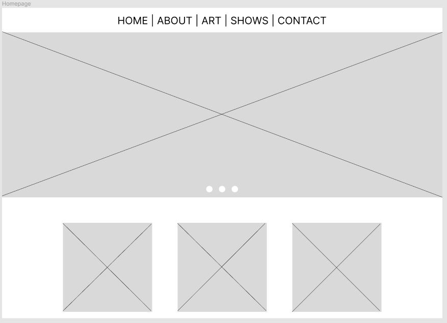
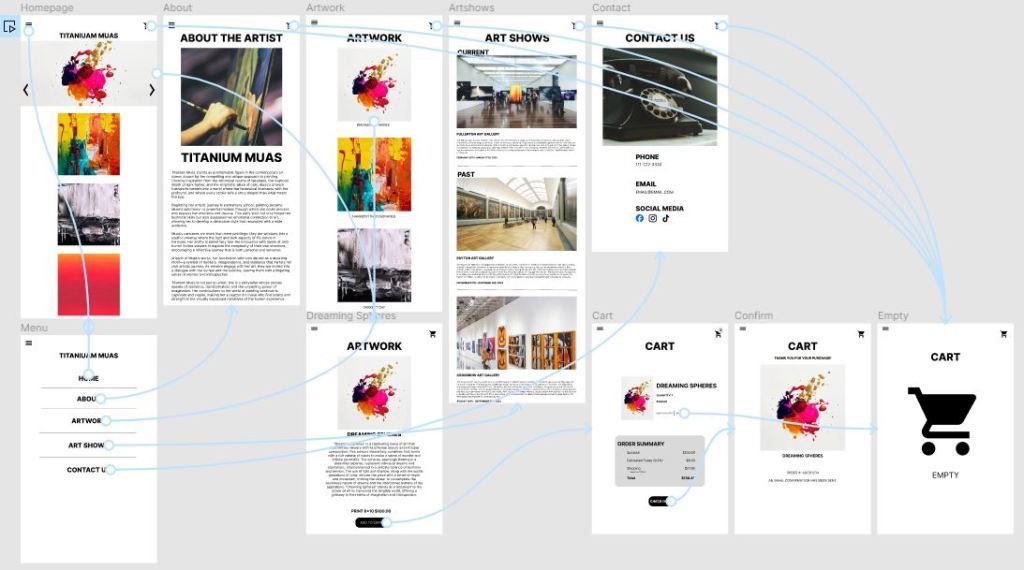
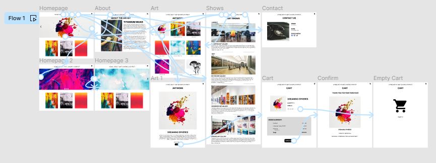
Paper Wireframes
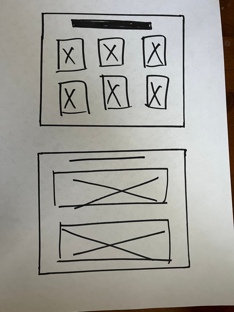

Digital Wireframe
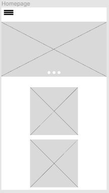
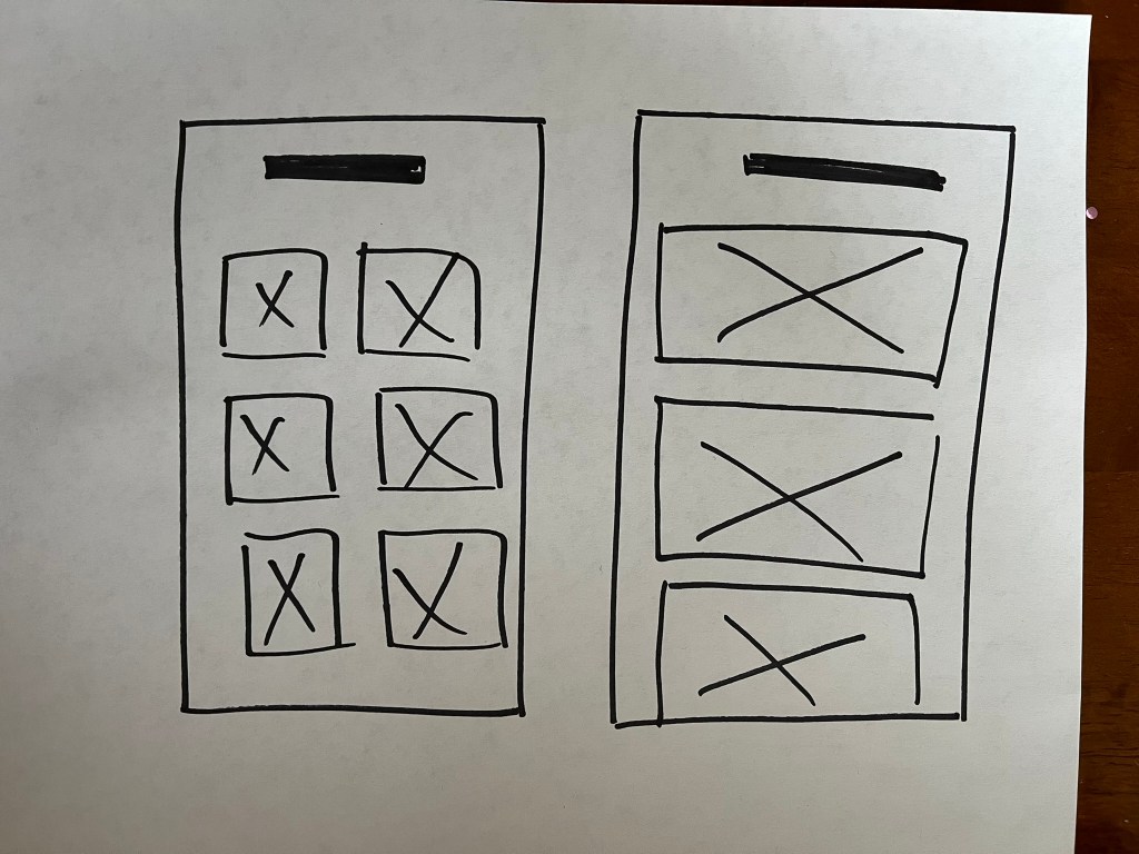
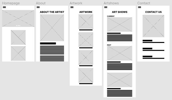
Lo-Fi Prototype
Usability Study
Parameters:
1. Unmoderated usability study
2. USA, remote
3. Five participants
4. 20-30 minutes
Findings:
1. Users experienced difficulty navigating the website’s menu system, often expressing frustration in locating specific sections or features.
2. The checkout process was found to be overly complicated, leading to a higher-than-average abandonment rate during online purchases.
3. Mobile users reported issues with the responsiveness of the interface, particularly on smaller screens, which affected their ability to easily interact with content and complete tasks.
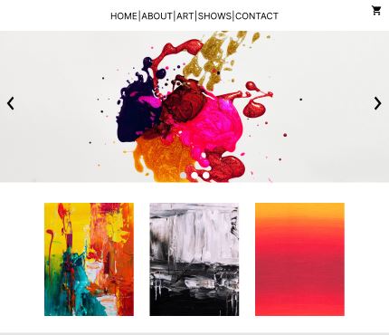
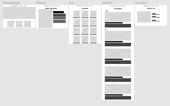
Hi-Fi Prototype
Accessibility Considerations
How to ensure that the website is accessible for all users:
1. Ensure that text can be easily read by providing sufficient contrast between text and background colors and allow users to adjust test sizes as needed for better readability.
2. Implement keyboard navigation and ensure all interactive elements are accessible through keyboard shortcuts to accommodate users who cannot use a mouse or touch screen.
3. Provide alternative text descriptions for all images, videos, and the audio files to support users who rely on screen readers to understand content that is not text-based.
Takeaways
Impact:
My website design significantly enhanced user engagement and accessibility, resulting in a marked increase in both user retention and satisfaction. By prioritizing intuitive navigation and responsive design, I created an inclusive digital environment that caters to a diverse user base.
What I learned:
Throughout the process of designing a responsive website, I learned the importance of flexible layouts, scalable images, and media quieries to ensure content looks good on any device, from desktops to smartphones. I gained insight into the significance of user testing across different platforms to identify and fix issues, ensuring a seamless user experience.
 ARA COUNSELING